
The Foundation of a Restful Bedroom: Why You Should Always Choose Neutral Sheets
When you decide to redesign your bedroom, picking out the bedding is usually the most exciting part. It’s tempting to grab the boldest, brightest patterns you can find to make a big design statement. While vibrant duvets and colorful throw blankets certainly have their place, your foundational layers need a different approach. The base of your bed sets the tone for your entire sleeping environment, which is why sticking to neutral colors is a design rule you shouldn’t break.
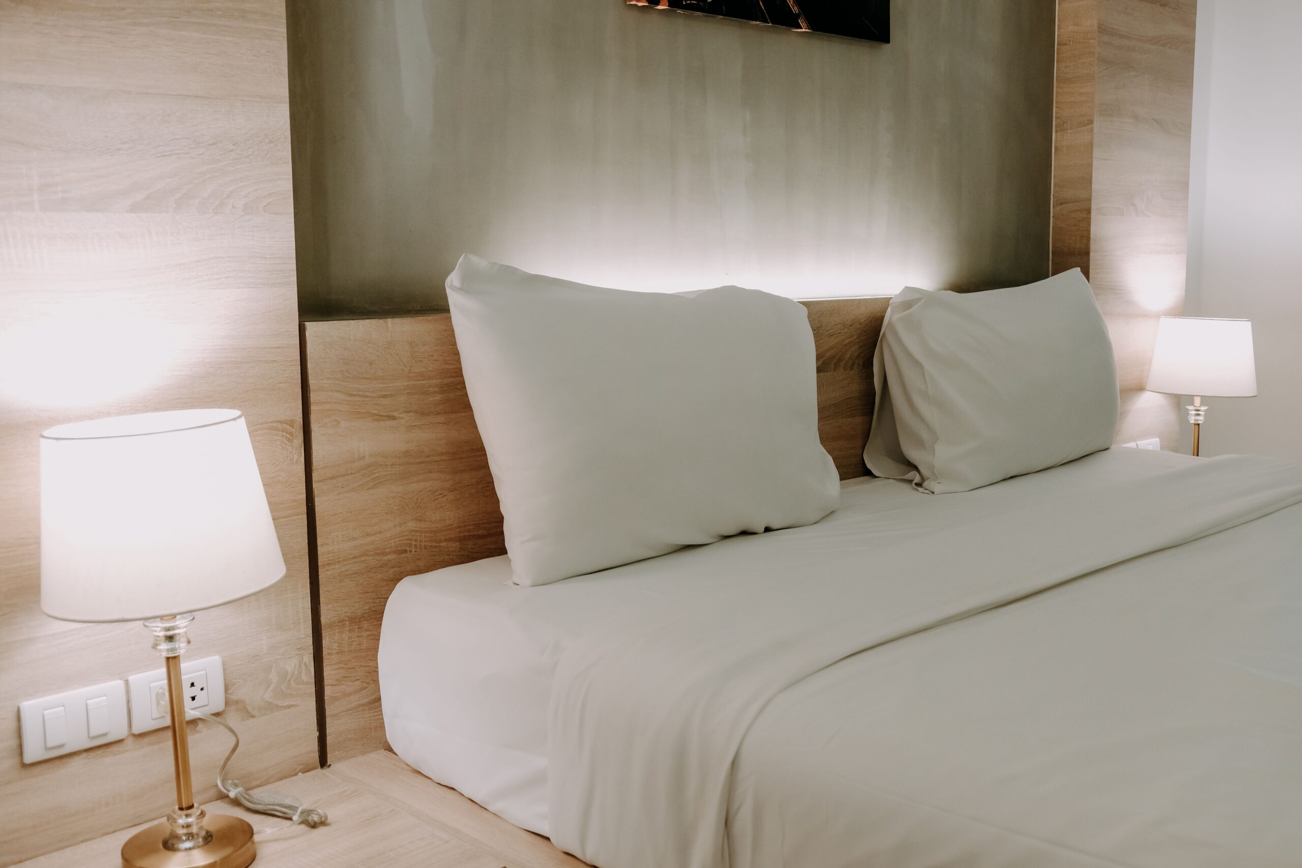
Starting with a set of crisp white, soft ivory, or gentle gray bamboo sheets gives you a functional and beautiful starting point. This simple choice transforms your bedroom from a chaotic space into a calming sanctuary. If you usually reach for loud prints or dark jewel tones, here is why you need to rethink your base layers and embrace the power of neutral bedding.
Creating a Calming Psychological Environment
Your bedroom has one primary purpose, and that’s to help you unwind and sleep. The colors you surround yourself with play a huge role in how quickly your brain transitions from daytime stress to nighttime relaxation. Bright, vibrant colors like fire engine red, bright blue, or neon yellow are highly stimulating. They force your eyes to stay active and can actually increase your heart rate, making it much harder to fall asleep.
Neutral tones do the exact opposite. Soft whites, warm beiges, and muted grays are visually quiet. They don’t demand your attention. When you pull back the covers and see a serene, neutral canvas, it sends a subconscious signal to your brain that it’s finally time to rest. Creating this visual quiet zone helps lower your stress levels so you can drift off faster and enjoy a deeper, more restorative night of rest.
The Ultimate Design Versatility
If you’re someone who loves to change up your room’s aesthetic with the seasons, neutral sheets are your best friend. Think of them as the perfect blank canvas for your bedroom decor. If you buy a set of bright floral sheets, you’re locked into that specific look. Every blanket, pillow, and piece of wall art you buy has to match that exact pattern.
When you use neutral tones for your base, your design options become limitless. You can toss a chunky burnt orange knit blanket on the bed for autumn, switch to a rich velvet forest green duvet for winter, and swap in light pastel throw pillows for spring. The base layer seamlessly matches whatever decorative mood you’re in. You get to completely reinvent your space whenever you want without having to buy a brand new set of sheets every single time.
The Hotel Feel of Freshness and Cleanliness
There’s a specific reason why high-end luxury resorts and boutique hotels almost exclusively use white or light neutral bedding. It instantly communicates a sense of pristine cleanliness. When you walk into a hotel room and see a perfectly made, crisp neutral bed, you immediately trust that the space is fresh and well-cared for.
You can easily replicate that five-star hospitality feeling in your own home. Dark colors and busy patterns tend to hide wear and tear, which sounds practical, but it often makes a room feel visually cluttered or dingy over time. Lighter shades brighten up the entire room, reflecting natural sunlight from the windows and making smaller bedrooms feel much larger and more open. Climbing into a bed that looks pristine and fresh elevates your daily routine, making a standard Tuesday night feel like a mini-vacation.
Avoiding the Trap of Micro-Trends
Interior design trends move incredibly fast. What looks chic and modern on social media today will probably look incredibly dated in two or three years. We’ve all fallen victim to buying a trendy home decor item only to regret it a few months later. Investing in bright, highly patterned bedding is an easy way to get tired of your own bedroom quickly.
Neutral sheets, on the other hand, are timeless. They looked elegant fifty years ago, and they’ll look elegant fifty years from now. They survive every passing trend because they rely on beautiful simplicity. When you buy high-quality bedding, you want it to last for years. You don’t want to replace it just because you grew tired of a geometric print. By sticking to classic shades, you’re making a smart, long-term investment in your home decor that you won’t eventually regret.
Highlighting Textures Over Colors
When you remove loud colors from the equation, you naturally start to pay more attention to the texture of your bedding. A monochromatic or neutral bed forces the eye to notice the subtle details that make a bed look truly inviting. The smooth, silky drape of your sheets, the quilted stitching on a coverlet, and the chunky weave of a throw blanket suddenly take center stage.
Layering different textures in similar neutral shades creates a sophisticated, dimensional look that interior designers use constantly. It makes the bed look incredibly plush and cozy without feeling busy or overwhelming. You’ll find yourself appreciating the actual feel and quality of your bedding rather than just being distracted by a loud print.
A Smarter Way to Style Your Sleep
Designing the perfect bedroom doesn’t mean you have to sacrifice your personal style or abandon color altogether. It just means understanding how to build a space from the bottom up. By choosing soft, neutral tones for your bottom layers, you create a peaceful foundation that promotes better sleep and offers endless design flexibility. It’s a simple, elegant solution that brightens your room and brings a touch of everyday luxury into your home. The next time you decide to refresh your linen closet, skip the bold patterns and embrace the calming, timeless appeal of neutrals. Your mind, your room, and your sleep cycle will thank you for it.